2/23/14
Anaheim Ducks Modern Home/Away Jerseys
Jacob Kummer
What I Like - The Logo is different and unique. I like the turquoise color instead of the orange. The Balacing of the color is okay.
What I Don't - On the Front Jersey on the white jersey has a blue stripe instead of an orange one. The colors seem a LITTLE to dark and could be lightened up a little in the dark jersey. The sock stripping isn't the same as is on the jersey
Final Score - 7/10
What I Don't - On the Front Jersey on the white jersey has a blue stripe instead of an orange one. The colors seem a LITTLE to dark and could be lightened up a little in the dark jersey. The sock stripping isn't the same as is on the jersey
Final Score - 7/10
2/22/14
No Jerseys to Review
2/21/14
Chicago Blackhawks Home/Away Jersey
Jacob Kummer
What I Like - I like the more modern logos on both the shoulder patches and crest. I like how you kept it simple just like the logos. I also like the stripping pattern in both the socks and the jersey.
What I Don't - The Red Jersey seems a little too bright. The Numbers on the arms seem a little crooked. Some of the lines in the jersey could have been removed. Some of the outside lining around the numbers on the arms are missing.
Final Score 8.8/10 on the White and 8/10 on the Red
What I Don't - The Red Jersey seems a little too bright. The Numbers on the arms seem a little crooked. Some of the lines in the jersey could have been removed. Some of the outside lining around the numbers on the arms are missing.
Final Score 8.8/10 on the White and 8/10 on the Red
2/21/14
No Jersey Available to Review
2/20/14
No Jersey Available to Review
2/19/14
San Jose Sharks Alternate Jersey
Jacob Kummer
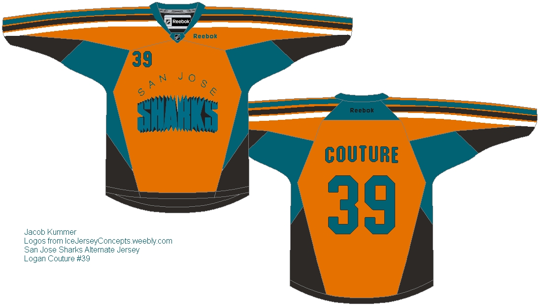
What I Like - I like how you chose the more rigid jersey because it goes with your logo. I have always liked this logo and this makes me love it more! The Stripping on the top of the jersey is well executed and looks good. The Lettering/Numbering aren't blurry.
What I Don't - There are some floating pixels around the collar, along with some spots in the jersey that just look of (I'm just getting picky now)
Final Score - 8.5/10
What I Don't - There are some floating pixels around the collar, along with some spots in the jersey that just look of (I'm just getting picky now)
Final Score - 8.5/10
2/18/14
USA Home/Away Jerseys, Logos from here
Jacob Kummer
What I Like - The Logo is very unique. The stripping matches the flag and the shoulder patches. The Eagle where the front number patch would good looks slick. The White and the Black are both balanced with the coloring
What I Don't - The Logo is pixelated and some of the colors carry over. The patches on the back side of the Jersey is stretched.
Final Score - 7/10 on both
What I Don't - The Logo is pixelated and some of the colors carry over. The patches on the back side of the Jersey is stretched.
Final Score - 7/10 on both
2/17/14
Chicago Blackhawks Alternate/Outdoor Jersey
Jacob Kummer
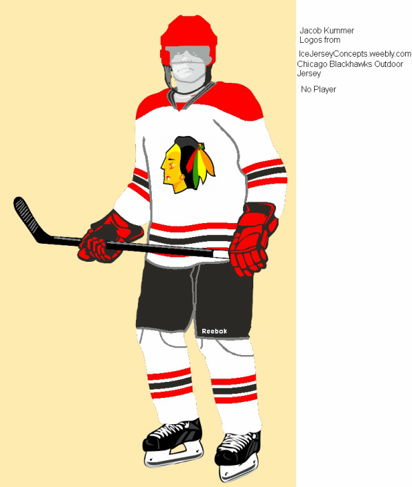
What I Like - I have always like 3d models and this is no exception. The logo is something very new and looks well with the brighter color scheme. They kept it simple with a clean logo. The gloves were well executed
What i Don't - The Helmet was not executed correctly. There could have been something done to the stick. Shoulder Patches would have been nice.
Final Score 8/10
What i Don't - The Helmet was not executed correctly. There could have been something done to the stick. Shoulder Patches would have been nice.
Final Score 8/10
2/16/14
Columbus Blue Jackets Alternate Jersey
Jacob Kummer
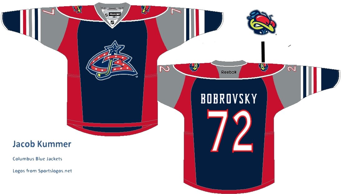
What I Like - Well first off this is an interesting design by going with the Old Logo but bringing forth a modern color scheme. But it just don't work. The Front Crest is right in the center and the lettering/numbering are very clear.
What I Don't - There are some left over dots that the editor didn't take care of. The Red and Blue in the front just don't mingle together. The Shoulder Patches and Shoulder Numbers just arent in the right place. But with work it could be great. So keep up the good work!
Final Score - 4.5/10
What I Don't - There are some left over dots that the editor didn't take care of. The Red and Blue in the front just don't mingle together. The Shoulder Patches and Shoulder Numbers just arent in the right place. But with work it could be great. So keep up the good work!
Final Score - 4.5/10
